
Untitled #14, 1999
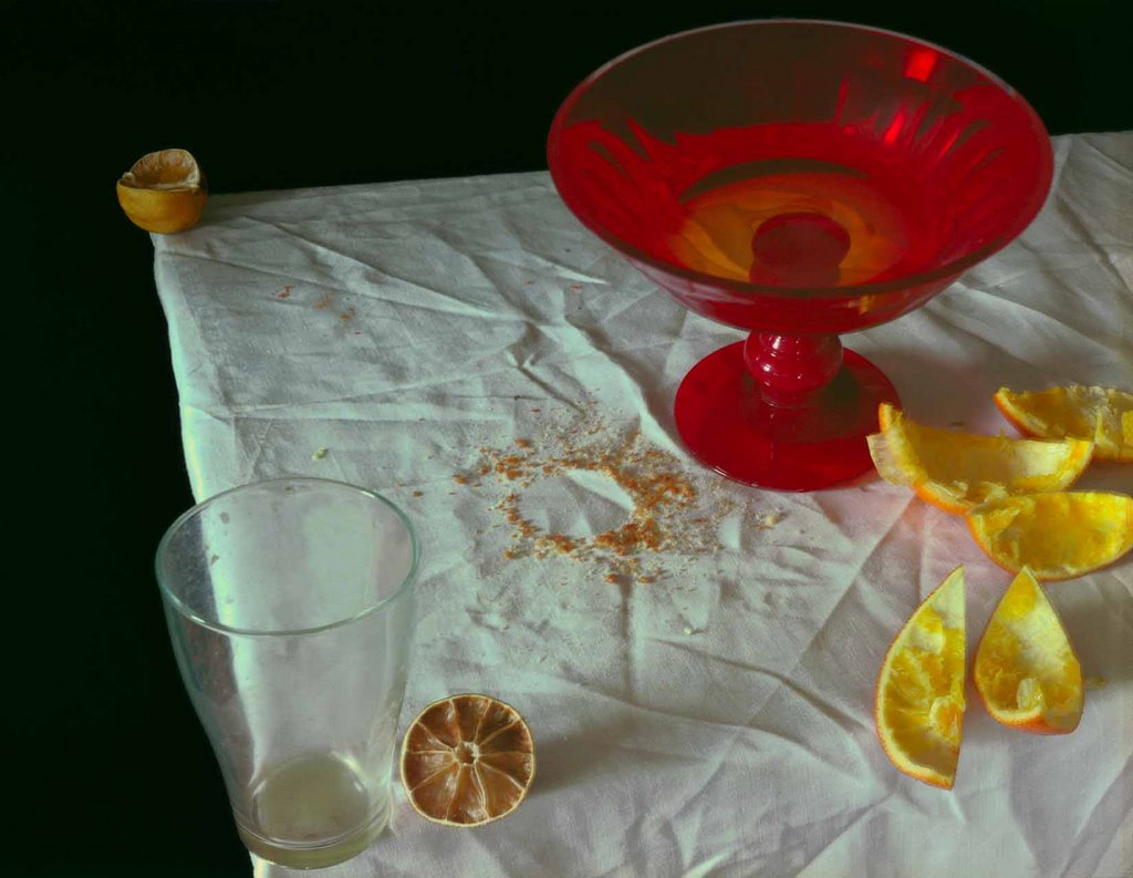
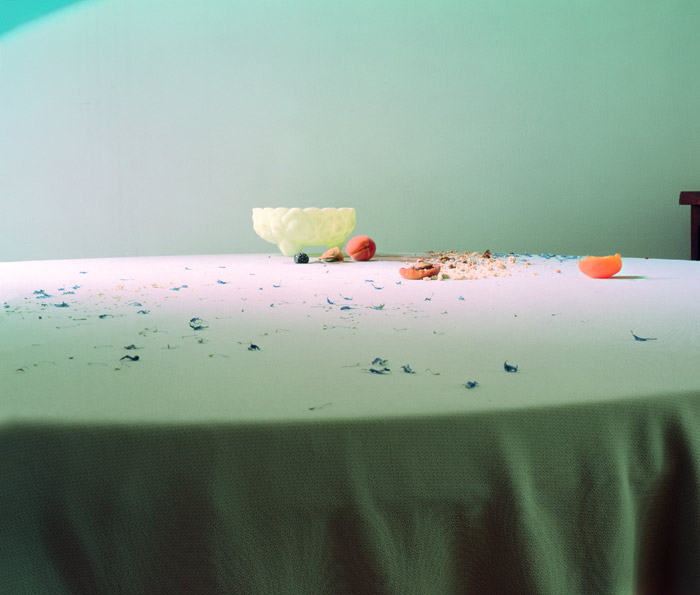
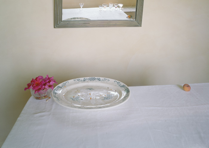
Letinsky's still life imagery “Hardly More than Ever” (1997-2004), is inspired by Dutch still life painting yet pushes the genre beyond its traditional intention. Her still lifes, taken in the morning light, are a residual record of previous gatherings, whether an intimate get-together or larger event. The leftovers become pieces of a vocabulary that construct a visual and emotive tableau distinctly human yet absent of people. Carefully arranged dirty plates, soiled linens, and crumpled napkins act as metaphors not only for the transience of personal interaction but also the fleeting cherished moments of our busy lives.
Untitled #10, 1999

Untitled #52, 2002
Untitled #80, 2003

Untitled #55, 2002

Untitled #54, 2002

Untitled #43, 2002
Untitled #92, 2004
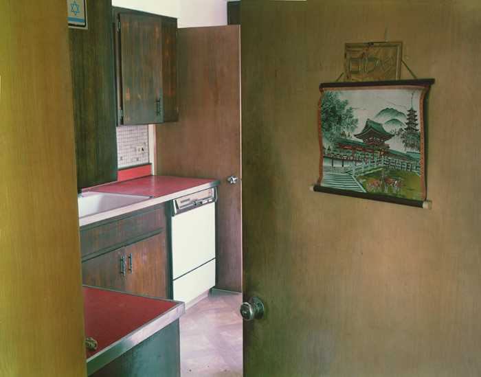
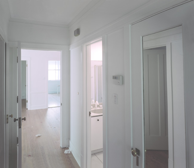
In "Somewhere, Somewhere" (2003 to the present), Letinsky photographed unfurnished rooms in temporary states of transition left with remnants of activity from a previous occupant and untouched by a new inhabitant. Through compositional elements, cropping, and light, the photographs descriptive function becomes an emotive document revealing the subtle complexity of these once intimate spaces. For example, an interior of a hallway reveals open and closed doors with mirrors and reflections that complicate the architecture. Light shines through the window and off the floor where discarded wrapping tissue sits waiting to be swept away.
Untitled #116, 2006

Untitled #111, 2005
Untitled #104, 2005
Questions-
- How would youdescribe Letinsky's use of color in her photographs?
- The author above describes Letinsky's work, writing that the objects in the photographs "act as metaphors not only for the transience of personal interaction but also the fleeting cherished moments of our busy lives." Do you agree?
- Do you find these photographs boring? Why, or why not?
4 comments:
I'm compelled by this idea of changing old ways of art yet I still find it annoying as well. Some of the shots really say alot about death, that sudden sharp moment when you are taken away, but some of the images are very ineffective. And the second set of images were incredibly boring, uninteresting, and I hope this artist fails in life.
I think Lindsey summed it up pretty well. I agree with her on every point.
I honestly don't find these images boring at all. I think that the artist has a good eye for detail. I don't particularly care for the last set of images as much as I did the first set of images, although the information about the images helps them a lot. I like the first set because of the use of color and the obvious design elements that's been incorporated from something that appears to have not been staged. I don't like staged images, so maybe that's why I like those so much, even if they were staged they don't appear to have been.
The use of color can be called "strategic". Elements of color are used in the scenes as a way to set the tones for the picture. Oranges rinds and cantelope slices set up a warm tone for the frame, brown drab walls establish a dark tone. These tones help convey the emotion behind set ups that are otherwise emotionless. The idea of discard is adressed here, as the authoer has painfully made hard to understand in their pretentious writing. And no I dont think the photos are boring. I wonder what's for breakfast, I'm starving.
Post a Comment